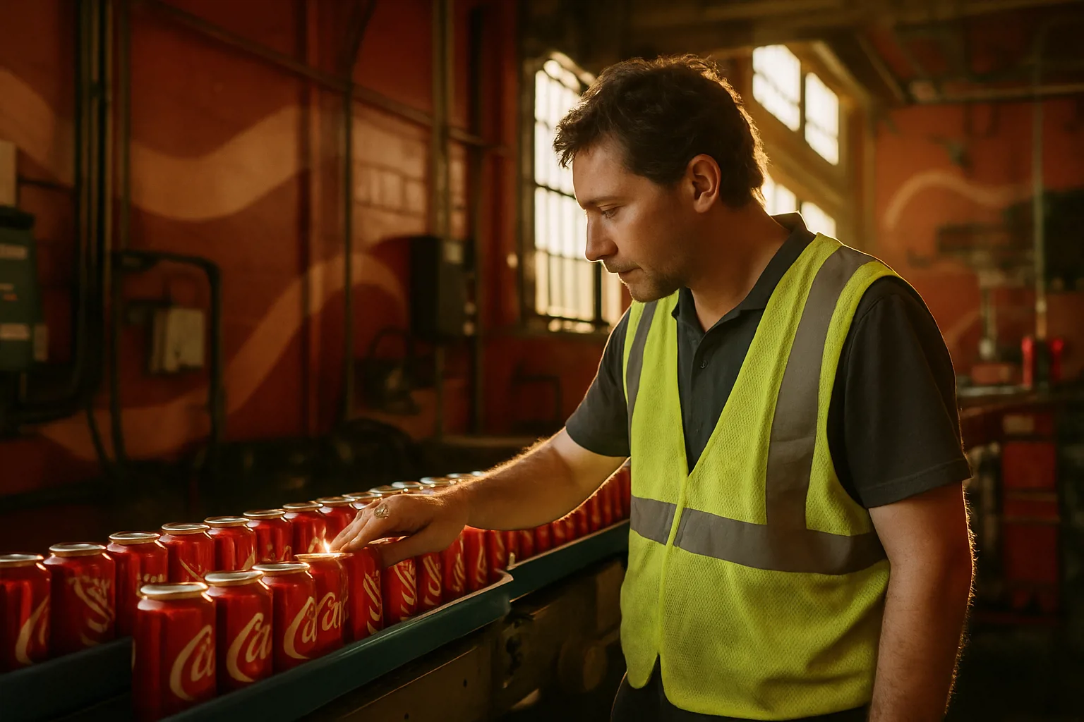
Coca-Cola's recent brand identity refresh emphasizes its iconic elements to unify its presence across over 200 markets. This redesign, developed with design agency JKR, introduces new visual elements like the 'Better With' typeface and aims to resonate with modern consumers.
- Coca-Cola unveils a bold new global brand identity.
- Iconic assets like the Dynamic Ribbon are emphasized.
- The 'Better With' typeface blends heritage with modernity.
- Design intelligence tools ensure consistent global rollout.
- Coca-Cola Zero Sugar gets a distinct new design.
Coca-Cola, a hallmark of global branding, is once again setting the stage for a new era with its latest brand identity refresh. This bold shift is not just cosmetic; it is a strategic move designed to enhance consistency and reinforce Coca-Cola's iconic presence across more than 200 markets worldwide.
Revitalizing Iconic Assets for a Consistent Presence
The heart of Coca-Cola's brand refresh is a renewed emphasis on its iconic assets. The red and white color palette, the Dynamic Ribbon, the Spencerian Script, and the Arden Square are more prominently featured in every aspect of the brand's visual presence. These elements are not just aesthetic choices; they are integral to the brand's identity, making Coca-Cola instantly recognizable.
Packaging and Platform Integration
These signature elements will now have a more pronounced presence across packaging, retail environments, equipment, and digital platforms. This integration ensures that regardless of where a consumer encounters the brand, the experience is cohesive and unmistakably Coca-Cola.
Distinctive Redesign for Coca-Cola Zero Sugar
In line with the refreshed identity, Coca-Cola Zero Sugar has undergone a notable redesign. The new look features larger "Zero Sugar" text, a black Dynamic Ribbon on cans, and a black bottle cap on PET packaging. This design update not only differentiates the product within the lineup but also emphasizes its unique selling point.
- Larger "Zero Sugar" text for clear identification.
- Black Dynamic Ribbon on cans for visual impact.
- Black bottle cap to distinguish PET packaging.
Global Rollout: A Unified Brand Ecosystem
The new brand identity is already making waves across regions such as Latin America, Europe, the Middle East, and Asia. This phased rollout will eventually encompass additional markets, ensuring a unified brand ecosystem that resonates universally.
"Coca-Cola’s refreshed identity is about creating a visual experience that’s as timeless as it is contemporary, allowing the brand to connect with consumers on a deeper level."
Collaborative Design Effort
This transformation was developed in collaboration with the design agency Jones Knowles Ritchie (JKR). Their task was to craft a brand environment that is both expressive and seamless, embodying Coca-Cola's storied heritage while appealing to modern sensibilities.
Introducing the 'Better With' Typeface
A standout feature of the redesign is the introduction of the 'Better With' typeface. Created by Brody Associates in 2023, this retro-inspired serif font merges Coca-Cola's rich history with modern design elements, offering a fresh take on traditional branding.
Leveraging Design Intelligence Tools
To support this ambitious global rollout, Coca-Cola has implemented new design intelligence tools. These tools are critical for maintaining consistency and governance across various internal teams and agency partners, ensuring that the brand's visual language is uniformly applied worldwide.
How Businesses Can Benefit from Coca-Cola's Strategy
This comprehensive brand refresh illustrates the importance of evolving while staying true to core values. Businesses can learn from Coca-Cola's approach by prioritizing consistency in branding, embracing iconic elements, and leveraging new technologies to maintain relevance in a rapidly changing market landscape. For businesses looking to refresh their brand, these strategies offer a roadmap to achieve sustained global appeal.
Frequently Asked Questions
What are the main features of Coca-Cola's new brand identity?
Coca-Cola's new brand identity focuses on its iconic elements like the red and white color palette, Dynamic Ribbon, Spencerian Script, and introduces the 'Better With' typeface. It also includes a redesign for Coca-Cola Zero Sugar with larger text and distinctive design elements.
How is Coca-Cola ensuring consistency in its brand refresh?
Coca-Cola is using design intelligence tools to maintain consistency and governance across its global rollout, ensuring that its visual identity is applied uniformly across markets.